Media Features
@media only screen and (min-width: 576px) {
  /** add styles here **/
}
Media Feature/Attribute
- Media features allows you to specify different viewport attributes and are always expressed in parentheses
  @media only screen and (min-width: 768px) {
    body {
      /* styles go here */
    }

    p {
      /* styles go here */
    }

    .some-style {
      /* styles go here */
    }

  }
- The styles in the media query above will only be applied when the viewport width is greater than or equal to 768px
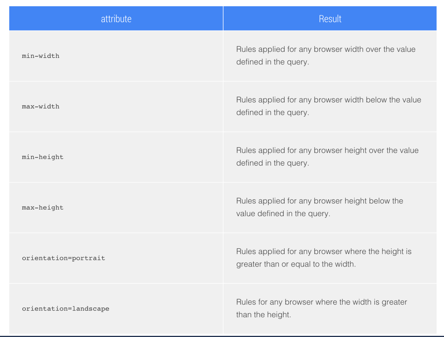
Available Media Query Attributes (Features)
The following is a list of Media Features available